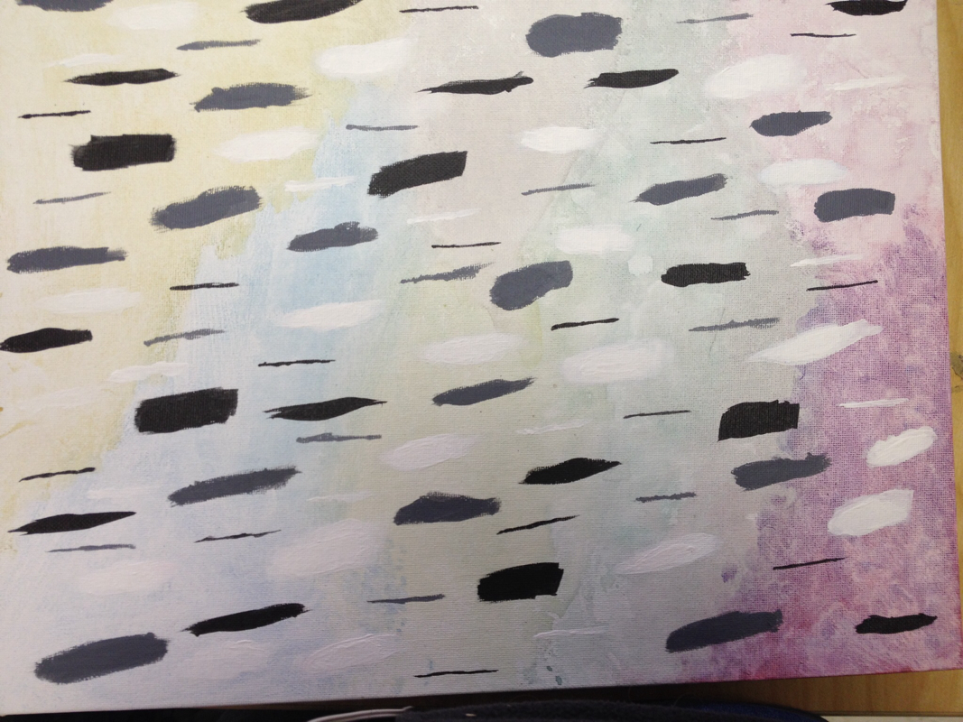
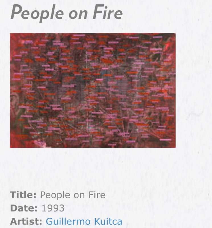
I picked the art piece that I did because I found the combination of colors (and the title) to be very interesting. It was colorful, but also had an interesting gray background. When I was originally planning my piece out, I decided to almost just remake that piece, only make it a bit simpler. I stuck to using contrasting background and dash colors, like the piece used. I also used the same pattern as shown in the painting.
I Take Risks
I risked a little bit on this project, as I didn't really know how well the color scheme would work. I originally was hoping to do bright and pale colored backgrounds, but it didn't really turn out well in the end. To be honest, I'm still not too happy about the way the background turned out. One corner ended up a bit darker than the rest of the background!
I Solve Problems
I solved quite a few problems while doing this project, actually. I didn't realize that putting watercolor on a flat canvas is kind of hard to do...
The paint kept beading up and wouldn't stick to the canvas! I had to really work hard just to get the water color to stay on.
The second problem I encountered was the fact that my dashes ended up a bit wider than I would have liked. I seemed a bit frustrating at first, but everything turned out okay when I added some thinner lines to add contrast.
 RSS Feed